배운걸 바로 사용해서 활용해봐야겠지?
해당 링크로 들어가면
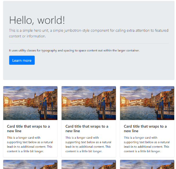
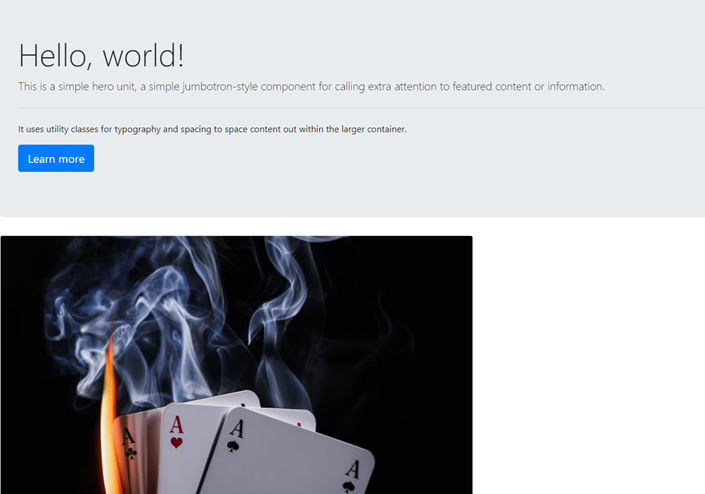
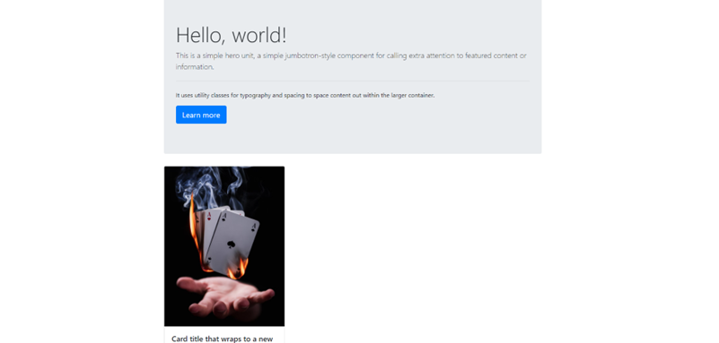
이런 화면이 나온다. 이걸 참고로 따라해서 꾸며 볼 예정이다.
가장 상단에 Hello, world!라고 적혀있는 구역을 Jumbotron 이라고 한다.
bootstrap에서 Jumbotron을 들어가 볼까?
(https://getbootstrap.com/docs/4.0/components/jumbotron/)
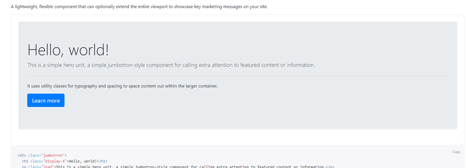
와우! 아주 그대로 있꾸만! 크크크
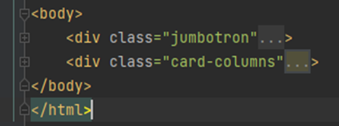
밑에 있는 코드를 복사해서 <body></body>에 쓰자.
<body>
    <div class="jumbotron">
        <h1 class="display-4">Hello, world!</h1>
        <p class="lead">This is a simple hero unit, a simple jumbotron-style component for calling extra attention to
            featured content or information.</p>
        <hr class="my-4">
        <p>It uses utility classes for typography and spacing to space content out within the larger container.</p>
        <p class="lead">
            <a class="btn btn-primary btn-lg" href="#" role="button">Learn more</a>
        </p>
    </div>
</body>
이후 페이지를 확인해봤다.

이제 밑에 있는 Card columns가 필요하다. Bootstrap에서 가져오자
(https://getbootstrap.com/docs/4.0/components/card/)
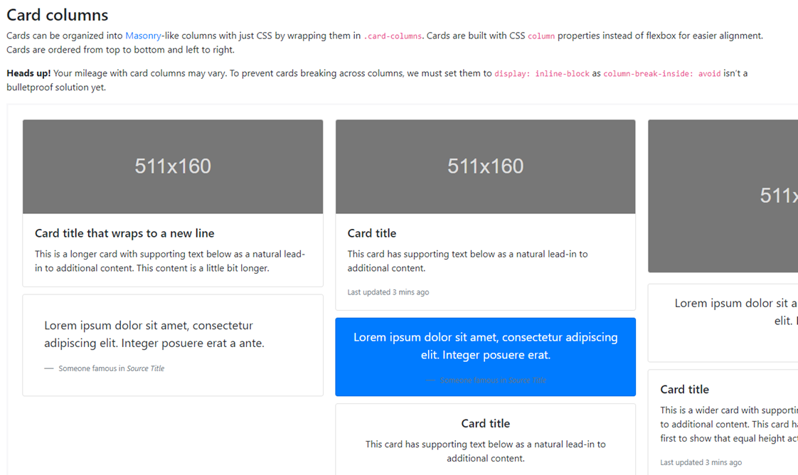
사이트에 들어가서 한참을 내려가야 마주칠 수 있었다.
참고로
 |
 |
저 빨간 동그라미에 있는 "-"를 누르면 오른쪽 그림처럼 접힘 상태가 된다.
다시 누르면 펼쳐지겠지? 접혀져 이:ㅆ어도 해당 구역을 복사하면 모든 코드가 복사된다.
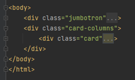
아무튼 일단 jumbotron은 접어두고 card columns를 붙여넣기 했다. 현재 아래와 같다.
<body>
<div class="jumbotron">
<h1 class="display-4">Hello, world!</h1>
<p class="lead">This is a simple hero unit, a simple jumbotron-style component for calling extra attention to
featured content or information.</p>
<hr class="my-4">
<p>It uses utility classes for typography and spacing to space content out within the larger container.</p>
<p class="lead">
<a class="btn btn-primary btn-lg" href="#" role="button">Learn more</a>
</p>
</div>
<div class="card-columns">
<div class="card">
<img class="card-img-top" src="..." alt="Card image cap">
<div class="card-body">
<h5 class="card-title">Card title that wraps to a new line</h5>
<p class="card-text">This is a longer card with supporting text below as a natural lead-in to additional
content. This content is a little bit longer.</p>
</div>
</div>
<div class="card p-3">
<blockquote class="blockquote mb-0 card-body">
<p>Lorem ipsum dolor sit amet, consectetur adipiscing elit. Integer posuere erat a ante.</p>
<footer class="blockquote-footer">
<small class="text-muted">
Someone famous in <cite title="Source Title">Source Title</cite>
</small>
</footer>
</blockquote>
</div>
<div class="card">
<img class="card-img-top" src="..." alt="Card image cap">
<div class="card-body">
<h5 class="card-title">Card title</h5>
<p class="card-text">This card has supporting text below as a natural lead-in to additional content.</p>
<p class="card-text"><small class="text-muted">Last updated 3 mins ago</small></p>
</div>
</div>
<div class="card bg-primary text-white text-center p-3">
<blockquote class="blockquote mb-0">
<p>Lorem ipsum dolor sit amet, consectetur adipiscing elit. Integer posuere erat.</p>
<footer class="blockquote-footer">
<small>
Someone famous in <cite title="Source Title">Source Title</cite>
</small>
</footer>
</blockquote>
</div>
<div class="card text-center">
<div class="card-body">
<h5 class="card-title">Card title</h5>
<p class="card-text">This card has supporting text below as a natural lead-in to additional content.</p>
<p class="card-text"><small class="text-muted">Last updated 3 mins ago</small></p>
</div>
</div>
<div class="card">
<img class="card-img" src="..." alt="Card image">
</div>
<div class="card p-3 text-right">
<blockquote class="blockquote mb-0">
<p>Lorem ipsum dolor sit amet, consectetur adipiscing elit. Integer posuere erat a ante.</p>
<footer class="blockquote-footer">
<small class="text-muted">
Someone famous in <cite title="Source Title">Source Title</cite>
</small>
</footer>
</blockquote>
</div>
<div class="card">
<div class="card-body">
<h5 class="card-title">Card title</h5>
<p class="card-text">This is a wider card with supporting text below as a natural lead-in to additional
content. This card has even longer content than the first to show that equal height action.</p>
<p class="card-text"><small class="text-muted">Last updated 3 mins ago</small></p>
</div>
</div>
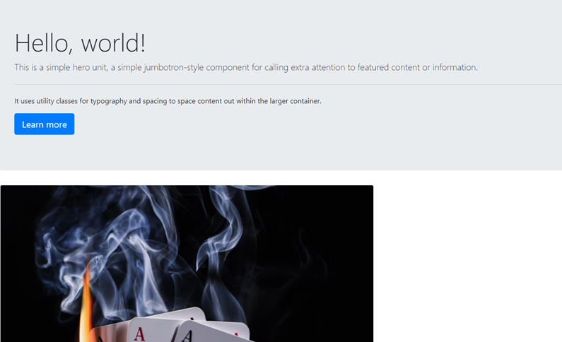
</div>길다?.. 일단 이대로 저장하고 화면을 확인해보자.
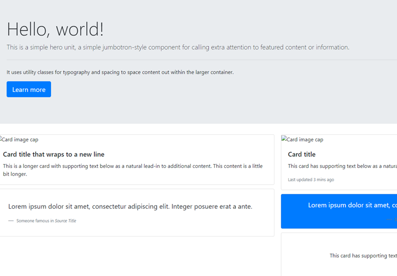
이런저런 창이 더 생겼으니.. 카드들이 들어갔군. 하지만 예시처럼 카드에 배경 이미지가 없다. 왜 일까?
뭐.. 당연히 이미지 주소가 없어서겠지?
<img class="card-img-top" src="..." alt="Card image cap">역시나 src="..."으로 아무 내용이 없다. 나중에 넣어주자.
우선.. 저 예시 화면 중에 우리는 사실 빨간색 테두리의 카드만 필요하다.
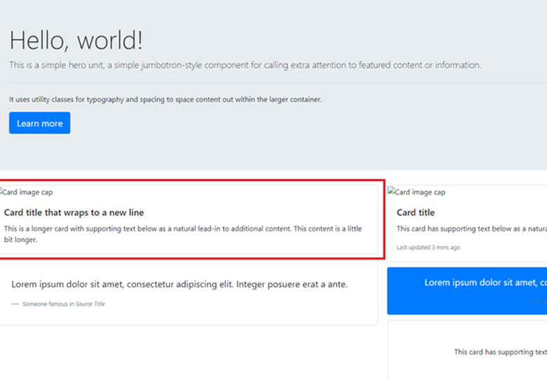
지금 복사해서 넣은 코드들 중에 어디 까지를 사용해야 하고 나머지는 지워야 할까?
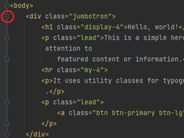
어디부분이 저 빨간 부분의 코드일까? 이럴 때 필요한게 개발자 도구다.
페이지에서 오른쪽 클릭 후 검사를 눌러보면 다음과 같은 창이 뜬다.
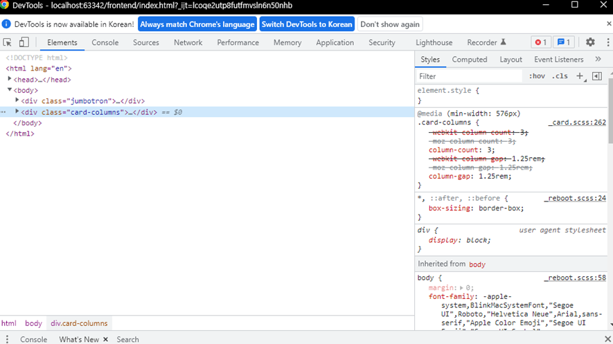
딱봐도 <div class="card-columns">...</div> == $0 이라고 적힌 곳같은데! 접혀 있으니 펼쳐보자
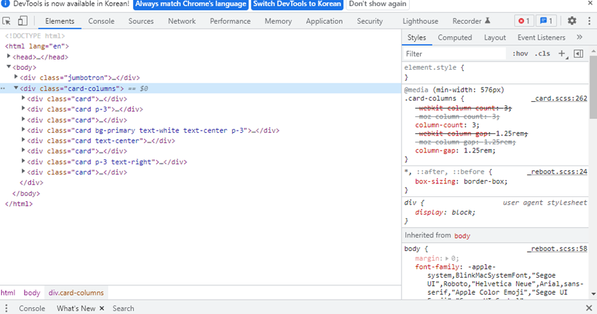
좋아, 구역이 저렇게 나뉘어져 있군?
마우스를 올려보면 해당 구역이 어딘지를 알 수 있다.
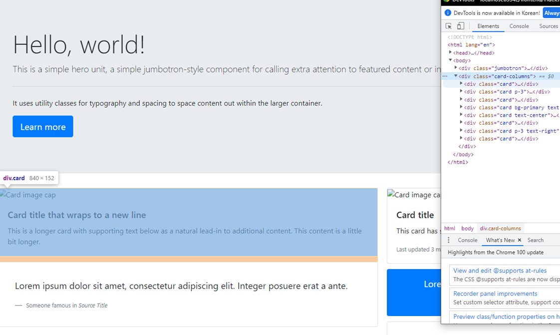
페이지에 파란색 구역이 나왔다?
그 아래도 마우스를 올려보자.
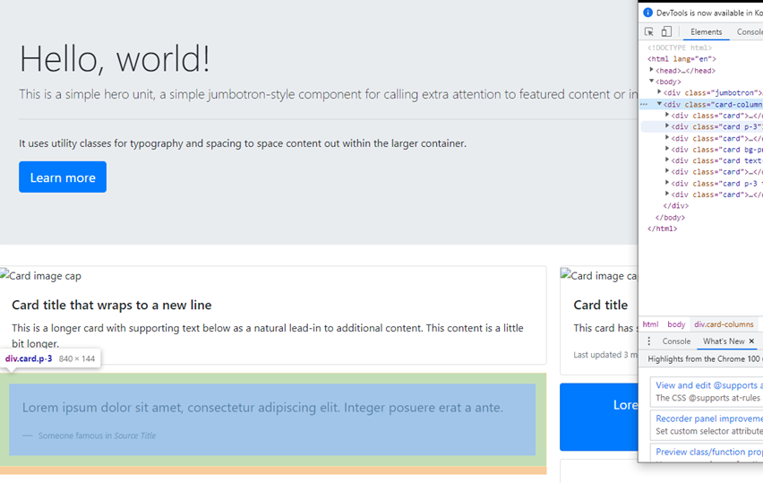
오? 이 부분은 이 구역의 코드군? 바로 알 수 있다. 여기서 툴에 있는 접기 기능을 사용하면 매우 편하다.
일단 저기 검사 화면 처럼 접어서 똑같이 표시해볼까?
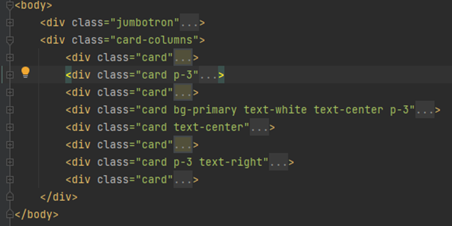
접어서 이 상태다. 우리가 사용하게 될 구역은? 첫번째 카드이니 나머지를 지워볼까?
매우 매우 깔끔해졌다. 이제야 좀 두통이 사라진 기분이다.
저 구역을 다시 펼쳐보자.
<div class="card-columns">
    <div class="card">
        <img class="card-img-top" src="..." alt="Card image cap">
        <div class="card-body">
            <h5 class="card-title">Card title that wraps to a new line</h5>
            <p class="card-text">This is a longer card with supporting text below as a natural lead-in to additional
                content. This content is a little bit longer.</p>
        </div>
    </div>
</div>
으음! 이미지 태그에 역시 이미지 주소가 없다. 아까 하기로 한 이미지를 넣어보자. 마.음.에.드.는.걸.로.
구글에 들어가서 검색 후 이미지를 찾아보자. 이후 마음에 드는 이미지를 찾았다면 오른쪽 클릭 후 이미지주소 복사를 눌러 주소를 복사해 붙여 넣어보자. (구글에 찾자고 했으면 사실 나는 https://unsplash.com 여기를 참고했다.)
<div class="card-columns">
    <div class="card">
        <img class="card-img-top" src="https://images.unsplash.com/photo-1556195332-95503f664ced?ixlib=rb-1.2.1&ixid=MnwxMjA3fDB8MHxwaG90by1wYWdlfHx8fGVufDB8fHx8&auto=format&fit=crop&w=736&q=80" alt="Card image cap">
        <div class="card-body">
            <h5 class="card-title">Card title that wraps to a new line</h5>
            <p class="card-text">This is a longer card with supporting text below as a natural lead-in to additional
                content. This content is a little bit longer.</p>
        </div>
    </div>
</div>
이미지 주소를 넣은 모습!
이 카드를 여러장 만들어볼까? 접은 후 복사 붙여넣기!
으.. 음.. 이미지가 너무 큰가?.. 나중에 수정해보고.. 왼쪽에 치우쳐져 있으니 가운데로 옮길 필요가 있어보인다.
전에 이것을 배웠다. wrap이라는 명창을 만들면서! 바로 만들어서 <head></head>안에 넣자!
<style>
    .wrap {
        margin: auto;
    }
</style>
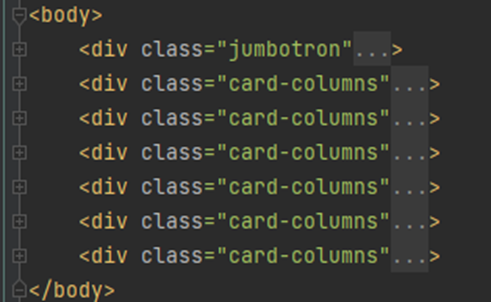
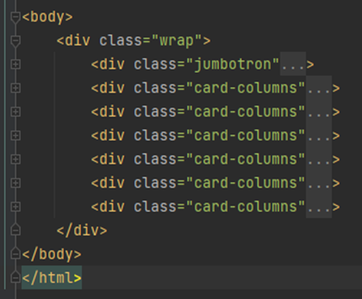
아차차, 나중에 작업하기 편하게 jumbotron과 card-columns도 하나의 구역으로 묶어준 뒤 적용하자.
해당 모양은 다음과 같은데..
<body>
    <div class="wrap">
        <div class="jumbotron">
        <div class="card-columns">
        <div class="card-columns">
        <div class="card-columns">
        <div class="card-columns">
        <div class="card-columns">
        <div class="card-columns">
    </div>
</body>
코드는 이런식으로 올렸지만 사실 저안에는 무수히 많은 코드들이 접혀져있는 상태이다.
전체를 다 가져오려니 너무 길어져서 음.. 혹시 모르니 적어두자.
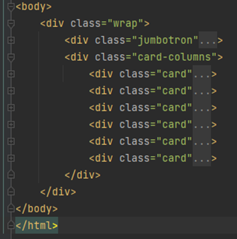
<body>
    <div class="wrap">
        <div class="jumbotron">
            <h1 class="display-4">Hello, world!</h1>
            <p class="lead">This is a simple hero unit, a simple jumbotron-style component for calling extra attention to
                featured content or information.</p>
            <hr class="my-4">
            <p>It uses utility classes for typography and spacing to space content out within the larger container.</p>
            <p class="lead">
                <a class="btn btn-primary btn-lg" href="#" role="button">Learn more</a>
            </p>
        </div>
        <div class="card-columns">
            <div class="card">
                <img class="card-img-top" src="https://images.unsplash.com/photo-1556195332-95503f664ced?ixlib=rb-1.2.1&ixid=MnwxMjA3fDB8MHxwaG90by1wYWdlfHx8fGVufDB8fHx8&auto=format&fit=crop&w=736&q=80" alt="Card image cap">
                <div class="card-body">
                    <h5 class="card-title">Card title that wraps to a new line</h5>
                    <p class="card-text">This is a longer card with supporting text below as a natural lead-in to additional
                        content. This content is a little bit longer.</p>
                </div>
            </div>
        </div>
    </div>
</body>
길다.. 너무 길다.. 어쟷든..
이제 가운데로 이동했겠지?!
? 뭔데?
(고민의 시간)
(few minute later..)
후.. 그래 저 구역의 가로 길이를 설정해주지 않았어.. 좌우 공간이 있어야 이동 할 텐데! 멍청했다.
wrap을 수정하자..
<style>
    .wrap {
        width: 1000px;
        margin: auto;
    }
</style>
적용 후 새로고침!
편안해졌군.
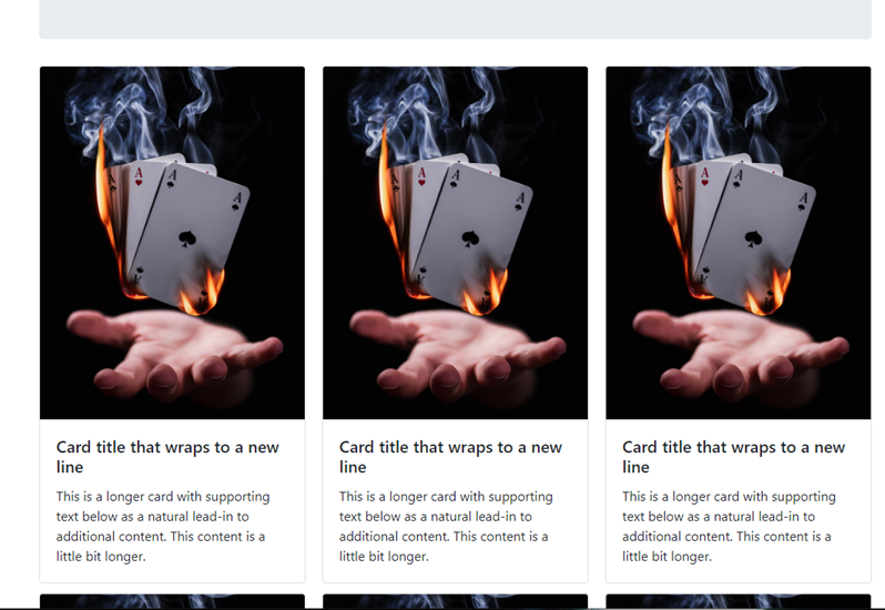
근데.. 왜 예시처럼 밑에 카드란이 3x2으로 안나오는거야?..
예시에는..
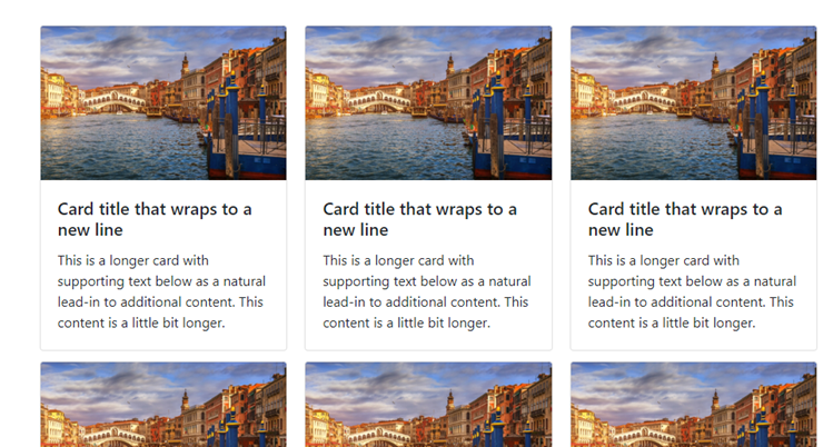
이런식으로 카드들이 나열되어 있는데..
내껀..
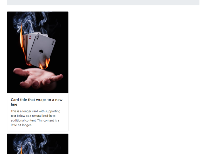
세로로만 쭉 나열되어 있는거지?.. 역시 이미지가 좀 커서 그런가? 수정해볼까?
<style>
    .wrap {
        width: 1000px;
        margin: auto;
    }
    .cardimg {
        height: 300px;
        width: 250px;
    }
</style>
cardimg라는 class를 만들고 중첩시켜야겠다.
이미지 링크 있는 곳에 넣으면 되겠지?
<div class="card-columns">
    <div class="card">
        <img class="card-img-top cardimg" src="https://images.unsplash.com/photo-1556195332-95503f664ced?ixlib=rb-1.2.1&ixid=MnwxMjA3fDB8MHxwaG90by1wYWdlfHx8fGVufDB8fHx8&auto=format&fit=crop&w=736&q=80" alt="Card image cap">
        <div class="card-body">
            <h5 class="card-title">Card title that wraps to a new line</h5>
            <p class="card-text">This is a longer card with supporting text below as a natural lead-in to additional
                content. This content is a little bit longer.</p>
        </div>
	</div>
</div>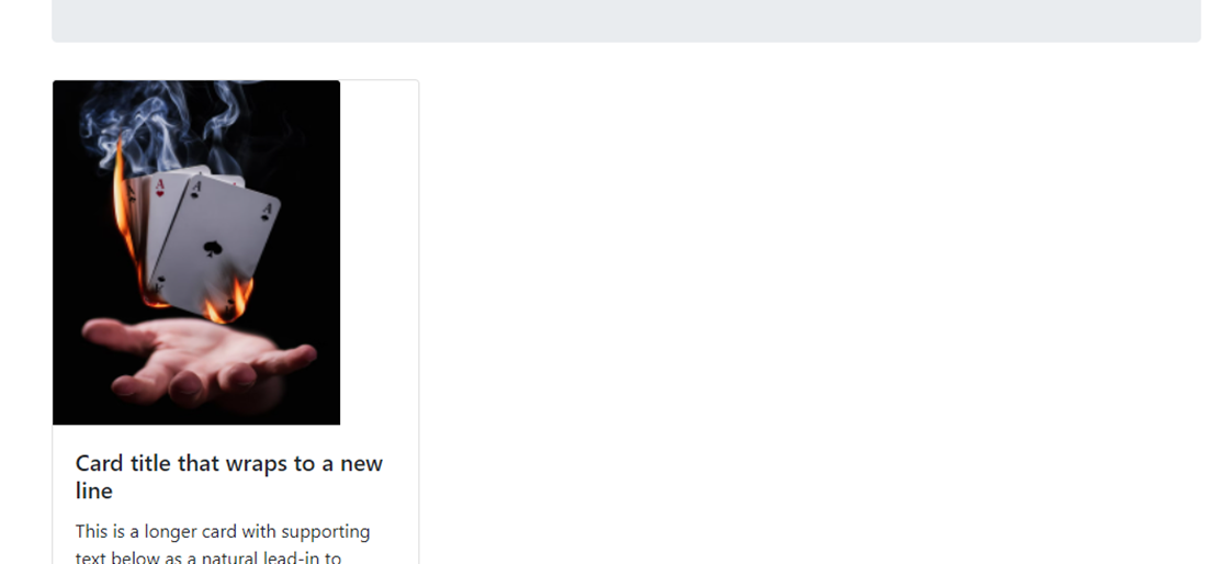
?.. 이미지는 줄었는데 안되네? 심지어 바깥 박스보다 작아졌어? 흠..
이미지 링크쪽이 아니고 카드 자체 구역에 해야하나?
다음과 같이 수정해봤다.
<div class="card-columns">
    <div class="card cardimg">
        <img class="card-img-top" src="https://images.unsplash.com/photo-1556195332-95503f664ced?ixlib=rb-1.2.1&ixid=MnwxMjA3fDB8MHxwaG90by1wYWdlfHx8fGVufDB8fHx8&auto=format&fit=crop&w=736&q=80" alt="Card image cap">
        <div class="card-body">
            <h5 class="card-title">Card title that wraps to a new line</h5>
            <p class="card-text">This is a longer card with supporting text below as a natural lead-in to additional
                content. This content is a little bit longer.</p>
        </div>
	</div>
</div>
?.. 카드 외각선은 또 어디갔어? 외각선이 그냥 줄어든건가? 여기도 아닌데 그럼 흐음..
card-body가 적용된 구역에 해줘야 하나?
그리고 다음과 같이 다시 수정을..
<div class="card-columns">
    <div class="card">
        <img class="card-img-top" src="https://images.unsplash.com/photo-1556195332-95503f664ced?ixlib=rb-1.2.1&ixid=MnwxMjA3fDB8MHxwaG90by1wYWdlfHx8fGVufDB8fHx8&auto=format&fit=crop&w=736&q=80" alt="Card image cap">
        <div class="card-body cardimg">
            <h5 class="card-title">Card title that wraps to a new line</h5>
            <p class="card-text">This is a longer card with supporting text below as a natural lead-in to additional
                content. This content is a little bit longer.</p>
        </div>
	</div>
</div>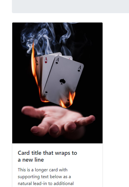
?????????????????? 어 음.. 이게 아니야? 발견된 오류는 없는데.. 작동은 하는데.. 어.. 음..
(thinking thinking)
(try again try again)
(few minute later... few minute later... again..)
하.. 원인을 찾았다. 나는 진짜 핵멍청한 바보인가보다. 나의 주름이 하나도 없는 것 같은 죄에 놀라 무릎을 탁 치게 만든다. 이걸 이렇게 했다니? 이게.. 나의 수준? 하.. 뭐가 문제인지 적어보자.
새로운 class를 만들어서 중첩부여 할 필요도 없었다.
깨달음 전과 후의 스샷을 첨부한다.
 |
 |
차이가 느껴지는가? 아까 개발자 도구로 어디까지의, 어느부분의 코드를 복제하여 사용 할지 정했다.
분명 내 눈으로 보고 했는데... 그걸 감싸는 card-columns 자체를 복제해버렸다..
그 안에 있는 card한장을 복제하여 추가해야 하는데.. 하.. 날려 버린 나의 시간.. 멍청미가 늘어난 나의 뇌.. 이대로 나는 괜찮을까? 그래도 스스로 깨닫고 수정했따는 것에 의미를 가지자.. 아니면 너무 슬퍼지니까...
수정된 화면이다. 하.하.하.하.하.하. 너무 행복해!
여기서 일단 멈추고 나중에 추가작업을 해야겠다..
'CSS' 카테고리의 다른 글
| Posting Box 만들기 (0) | 2022.05.07 |
|---|---|
| Bootstrap 이용하여 페이지 꾸미기2 (feat. 추가작업) (0) | 2022.05.07 |
| Bootstrap? 예쁜 CSS 모음집 (0) | 2022.05.06 |
| 폰트, 주석, 파일분리 (0) | 2022.05.06 |
| CSS 연습하기 (feat. 로그인 페이지) (0) | 2022.05.05 |